What happens when huge organisations realise that despite the services they come up with, they are still bound to fall short sooner or later? Or worse, when the processes they have in place start to affect their end customers? One solution would be bringing people that can take a step back and see the problem holistically. This is where design thinking & doing tends to shed some light to the issue… The solution is usually not a linear process. These are some of the steps taken to solve big organisational complications like the ones in our case
Start your war!(room)
You want your project space to feel organised and functional (to be able to perform any action with minimum effort) the same way you would want your own home to be. If you are lucky to work in a company that understands the making of Customer Experience Design, you will be assigned a space to turn into a creative war room. We gave the walls their own mission; One to hold the customer’s journey as we further explore it, one to host our ideas and inspiration and another where different stakeholders are invited to evaluate our progress and add their input. For anything that could not fit, we used mount boards. Be messy!
In sketch we trust
Yes we live in a commercial world and it is easy to fall in the trap of feeling insecure about our relationship with the simplest of tools; pen and paper. It really doesn’t matter when you work with a partner. Sketching can prove not only productive but also entertaining and a perfect way to meet someone in the middle. No need to be proficient in software. Just simple shapes on a paper would do.
In software we value
How about seeing your ideas and sketches turn into something you can share and feel good about it? That is one way digital can play a valuable role. The core ideas already exist, but now you can future proof, edit, “undo”, glitter and share them with anyone. In our case, story boards proved to be a great way to communicate with high-end stakeholders how Customer Experience can be found in a variety of formats, both offline and online. It also gave us the right fidelity to move those ideas forward. Not to mention that in many cases the client saw this as a creative act which was missing from their organisation, thus felt excited about showing it around.
If needed, improvise
There will be times that it is better to “come up” with your own design assets. Considering our time constraint we had, we still wanted to find a way to bring business closer to users’ mindsets. More specifically, by going deeper into the “what” and “why” behind people’s thoughts and actions. We combined elements from other more detailed design assets (e.g service blueprint & CX map) and after interviewing numerous people within the organisation, we developed proto-personas that were directly matched with the business goals. A good balance between business and customers needs if you like.
A mirror to your Service
The more we learnt about the “as today” functions of the organisation, the more we had to demonstrate where their services had room for improvements, needed to adapt or even create brand new ones. A service blueprint does a good job in showing the forest without losing sight of the tree. You will need a few rounds of testing to hit the right fidelity though.
Show & invite others to your customers’ experience
You might love travelling, you might talk about it all the time. But still, there will always be a need to open the real map. Why treat your project differently?
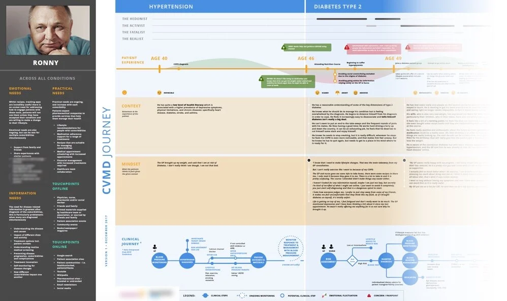
In our project, experience maps proved invaluable. We took raw data and turned them into comprehensible design assets. The very act of building those maps force you to see the problem you are facing under a different light. Where these assets really shine is when it brings people from different backgrounds together. Again, finding the right balance is key in being effective. You need to lay down all the pieces you have and assess which ones will make a good puzzle. Sometimes these pieces needs to be very tactical e.g the clinical journey, where other times can be deeply emotional e.g thoughts around a disease, emotions etc. We used these maps as the core workshop material and built all exercises around them.
Get interactive, prototype
Let’s be honest, very few things would excite your client more than a functioning “clickable” prototype, more so a prototype that came straight out of research! You took your client through your experience design thinking, you interviewed them, you presented your observations and key take aways. It is time to put this in front of their devices (if this is where your process took you).
As our project had to involve various stakeholder within a healthcare organisation, we developed different prototypes to showcase our different journeys. We wanted to capture everyone’s feedback even in parts of the project that were not directly related to their role in the organisation, thus encouraging them to think cohesively and further understand each other’s workflow.


