EMOTIONAL FOOTBALL
End client: FIFA | Consultancy: Monitise Create | Role: UX Designer & Architect
Overview
In a designer's career there are chances to work in a plethora of projects. Nevertheless, the true fulfilment comes in these unique cases where the everyday passion and professional skills meet. To shape a product that can be used by millions of people around the world while having the chance to influence and inspire the decision-making of truly global organisations. In my case, this could be reflected by my involvement with the FIFA official mobile app, where I have been given the responsibility to lead its user experience design.
Where FIFA app stands
FIFA app is the official mobile product of football’s governing body available for iOS and Android, phone and tablets devices since 2013. Its greatest milestone was undoubtedly the 2014 Brazil World Cup, with over 30 million downloads the app had become the most downloaded sports event app of all time.
It consists of exclusive editorial content such as news, photos and videos. In addition, live scores and minute by minute live action coverage, statistics, social media content, world rankings, mini games and stories to help users explore how FIFA supports football globally.
The Challenge
Following the huge success of the Brazil's World Cup, this case study covers the challenges found in the post Brazil tournament era. In brief the core challenges were the following:
Follow up, maintain and surface the great success of 2014 Brazil tournament
Archive in a smart and efficient manner the coverage of 2014 Brazil tournament
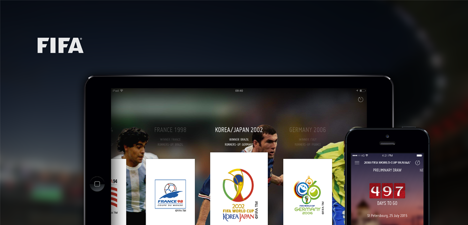
Bring to life and showcase all the tournaments in the history of the World Cup
Introduce and prepare for the next World Cup, in Russia 2018
Evolution of focus
A shared challenge for everything we had to do on this project were the hard delivery deadlines we had to work on, due to the importance of events organised by FIFA.
An additional challenge set by me was regarding keeping the focus of the app close to the fan's emotional needs as much as possible. Something which is of higher importance in a period when the biggest football event in the world is finished and the excitement is in decline. In order to communicate this to FIFA a "FIFA vs Fan-centric" diagram have been deployed
Discover
For the needs of this project, design thinking has been applied for the creation of a "big idea". It is this single concept or statement that would help empathise with the problem you have to solve and therefore provide better targeted solutions for the people you design for. In other words, a master thought that would guide design throughout the process.
"Going back in time"
Having in mind the challenge of surfacing the history of all the World Cups, we set our design and experience principles around the idea of "Going back in time". This concept have been explored further through mindmapping and moodboard exercises. What does going back in time could mean to us, to the football fan and to the world? What are the ingredients that could generate this emotional experience into our product? For example, could these be conveyed through the use of colour (black and white, sepia), texture, imagery or even by bringing back the nostalgia of our childhood, through old props and design trends of that time? These were just some of the questions we set ourselves while exploring further this idea.
Moodboard - Going back in time
Analysis of World Cup designs over time
There is a strong emotional bond between the football fan and the World Cup emblems. They can also reveal elements of each time period and the host country. In addition, someone could see how the digital evolution had a big influence in their design, moving from a very detailed poster design to a very simplistic logo look and feel. In our design we wanted to embrace this diversity of design and take the user in this journey.
Inspiration can come from anywhere. Even if this is a TV show like Mad Men, where a short clip called "The Carousel" can confirm your thinking in a way that you could never expect:
“Technology is a glittering lure.
But there is the rare occasion when the public can be engaged on a level beyond flash, if they have a sentimental bond with the product...
But he also talked about a deeper bond with the product: nostalgia. It’s delicate, but potent.
Teddy told me that in Greek nostalgia literally means ‘the pain from an old wound.’
It’s a twinge in your heart, far more powerful than memory alone.
This device isn’t a space ship. It’s a time machine. It goes backwards, forwards. Takes us to a place where we ache to go again.
”
Content Strategy
Another challenge of this project was in terms of archiving the old world cups in a way that the most important events of each tournament are easily discoverable and consumable
Important information such as the matches and the awards have been gathered and analysed in depth
World Cup matches & awards
Content strategy
Prototyping
Throughout the discovery phase several ideas were generated regarding different elements of design, such as interaction design, that had to be tested rapidly.
Initial interaction design tests
Define
Following the exploration of a strong and thoughtful concept in the discovery stage we defined the elements that would bring this concept to life. Enhancing the emotional experience of the app was our key driver.
Timeline
Timeline background
Cards
Cards initial designs
Deliver
At this stage it was key that the final deliverables would help keep all the stakeholders in track and guide them clearly of what is required at each stage of the project. The delivery methods varied from app maps, user flows, wireframes and technical specifications, interactive prototypes and animated mockups. The tools used, were selected according to the needs of each deliverable and these varied from Omnigraffle, Illustrator, Flinto and After Effects just to name a few.
App map and user flows
Wireframes
Animation design
Swipe to reveal Qatar 2022 World Cup
Animated clock in timeline
FINAL WORDS
FIFA app was a great challenge for every one in the team, but a challenge that everyone enjoyed and felt proud of. The feeling of having to design for something that millions of people love and use, was the greatest driving force. As a team we have been given the appropriate space to challenge and push the client requirements by working collaboratively towards a shared vision.
The challenge is anything but finished though. FIFA app is an ongoing project that requires continuous creative thinking and innovation. The future holds greater challenges, starting from the next World Cup, hosted by Russia in 2018. I am glad to be leading the experience of this product to its future adventures, so stay tuned...
Finally, here is a video that we created internally to inspire ourselves and see how our design could be part of the most amazing sport event in the world, the FIFA World Cup!


